
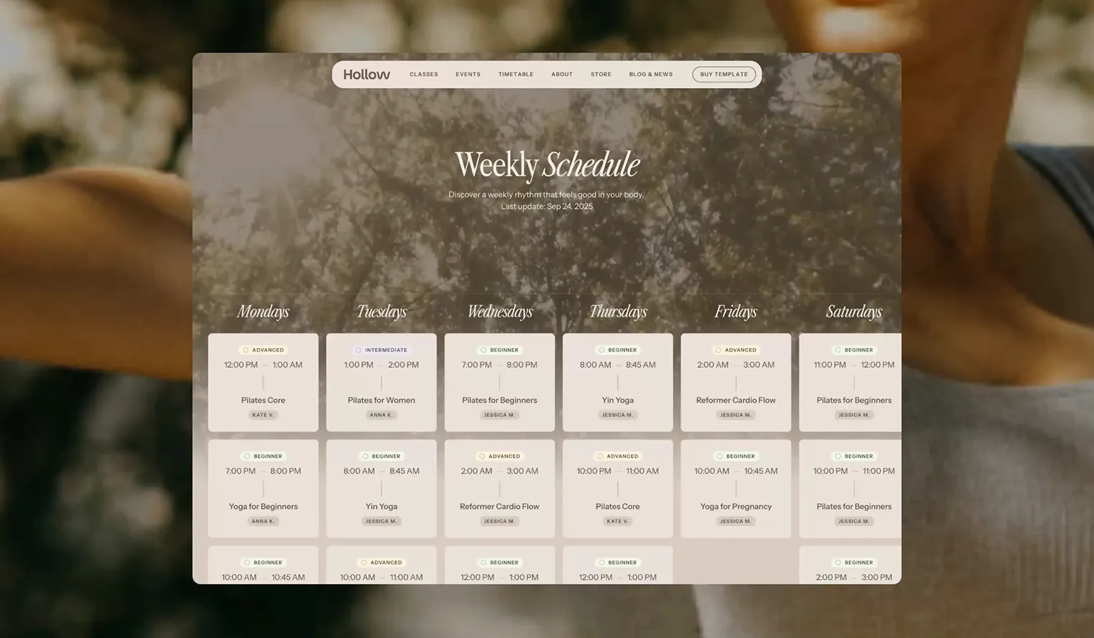
Users can browse classes by day or type. Each class page features clear descriptions, session times, and optional links to booking platforms like Booksy or Calendly. A dedicated CMS collection helps promote your seasonal retreats, workshops, or special events — fully filterable, with dates, pricing, and optional photo galleries.

Hollow carries a distinct softness — but it’s not fragile. The brand system was built to hold space: generous white space, earthy typography, and color tones that feel like early morning sun on wood floors. We selected type and spacing not just for legibility, but for stillness. It’s a calm aesthetic with structural bones underneath — ready to scale, ready to breathe.
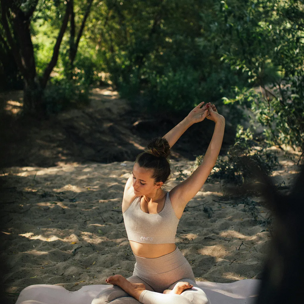
The visual identity isn’t loud or trendy — it’s rooted. Inspired by breath-led movement, Hollow’s visuals are slow, intentional, and warm. Everything was designed to make people feel: safe, open, grounded. Even when the site grows — adding shop pages, retreats, classes — the identity holds. It doesn’t break. It adapts.


Designing for mobile wasn’t an afterthought — it was a starting point. We crafted every element of Hollow™ with the mobile user in mind, from smooth spacing and tap targets to how information unfolds on scroll. The layout adjusts like breathwork: gently, intuitively, and without noise. Everything feels natural, readable, and fluid — like your fingers already know where to go.
Even animations and transitions were tuned to slower, calmer rhythms. On smaller screens, Hollow isn’t just responsive — it’s meditative. The schedule remains accessible with a thumb, the retreat cards stack softly, and all buttons feel like soft stones under your fingertips. This isn’t just mobile-friendly. It’s mobile-honest.